Better every day
Hello, we’re Iress - the global technology company on a mission to make it easier to love financial services. Every day we partner with financial services businesses of every size to help them grow, lead and deliver more for their customers.
At the heart of our mission is our belief that technology should help people perform better.
Tomorrow, or in five, ten or 20 years’ time when someone says ‘I love how that works’, or ‘I love my financial services provider’, ‘I love that result’ or ‘I love doing what I do’, what we really want them to be talking about is our software, and how it’s helping them achieve better performance every day.
If you’re designing for the Iress brand, use these guidelines and rules as your starting point. Then go forth, share the love and have fun. Just never change the angle of the logo icon and everything is possible.
If you require our full documented guidelines, they are available in the below link. If you are looking for something specific scroll through, to find logos, colours and other elements. If you are still in need of help, please contact Chris.May@iress.com
Full PDF
DownloadLogo files
DownloadWe designed the Iress logo to reflect high performance. Just like a chart depicting the trajectory of a high performing investment fund or client satisfaction measure, the Iress logo points up and to the right. The angle is also a nod to the old Iress logo, which used a slanted first letter.
Iress rule number 1: never change the angle of the logo.
The Iress logo is a core part of our brand identity and a shorthand by which people identify us. It should be used with consistency and care to help us build and maintain a recognisable brand. Where possible use the colour logos shown here. Always use the original master artwork files. Never try to recreate the logo – it should not be altered in any way.
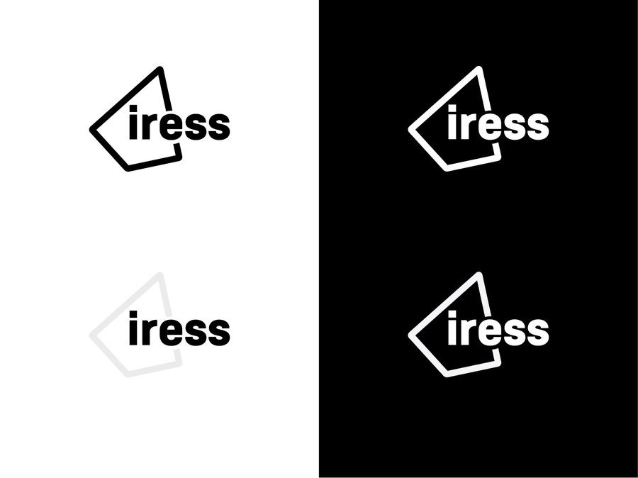
Monochrome
If you need to work in black and white circumstances, you can use a monochrome logo, as shown here. Always use the original master artwork files. Never try to recreate the logo – it should not be altered in anyway.
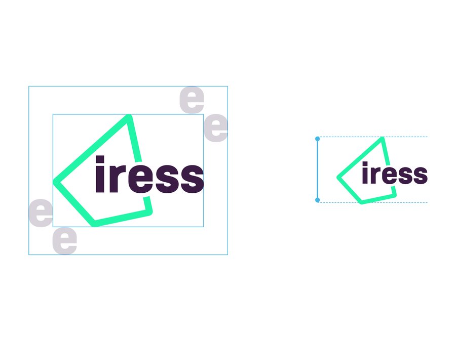
Exclusion & minimum sizes
To ensure our logo is represented clearly, we have defined an area around the logo that should be be kept clear of any other graphic element or typography. This exclusion zone is defined by the height of the ‘e’ as shown. This formula applies regardless of the reproduction size.
Use the height of the e to determine the exclusion zone
Minimum size for print: 6mm Minimum size on screen: 30px h
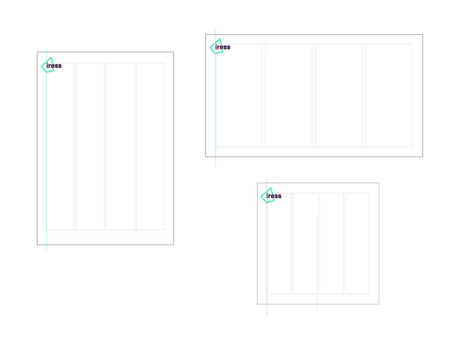
Our logo can sit in the top left hand side on a variety of orientations and image sizes.
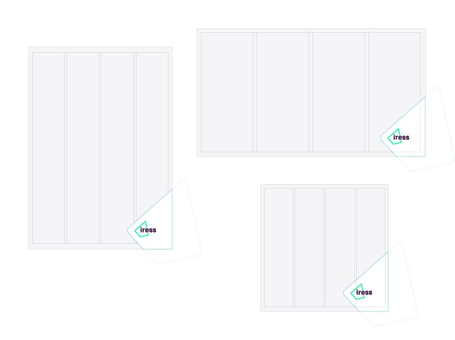
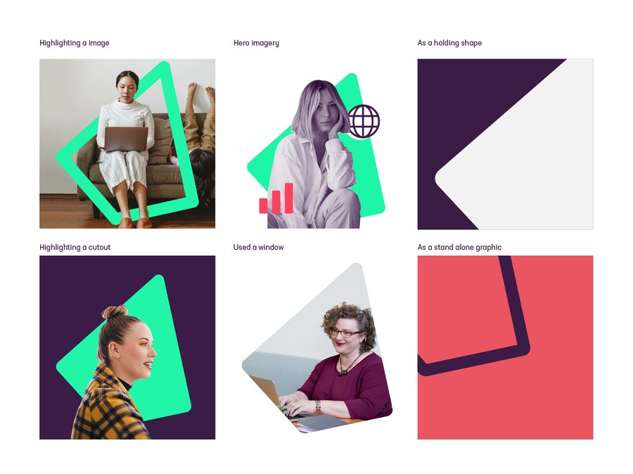
We can use the logo in the holding shape of our graphic device, in the bottom right hand corner. Sizing and positioning is adjustable based on size of the communication and the content but we aim for around 5% of an image. You can find more examples of how this works in the application chapter
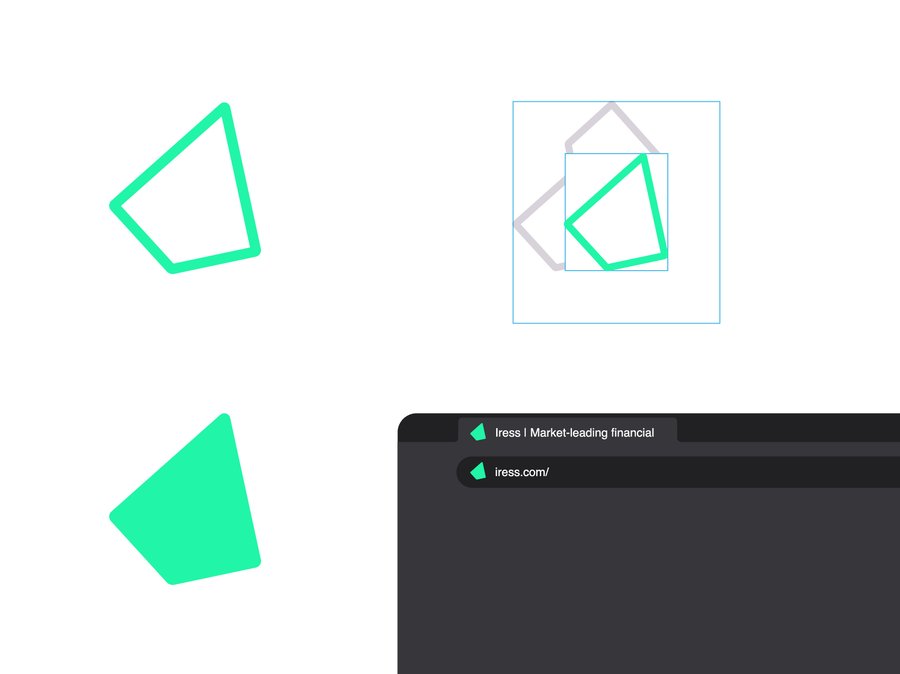
In some instances where space is limited, we can use the rocket/ graphic device on its own. For guidance on the graphic device proceed to the next section.
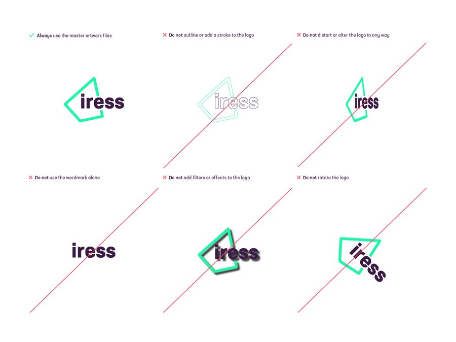
Our logo is an important part of our brand toolkit so we must use it with consistency and care. It’s a visual representation of high performance. Always use the original master artwork files. Never try to recreate the logo – it should not be altered in any way.
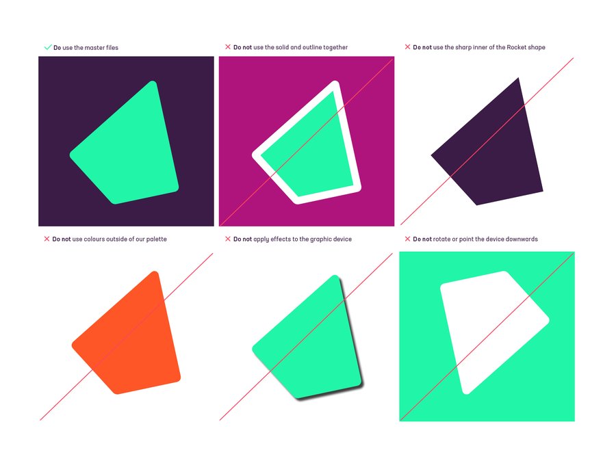
Our graphic device is developed from our logo. We call it the ‘rocket’ and we designed it to reflect high performance. Just like a chart depicting the trajectory of a high performing investment fund or client satisfaction measure, the Iress rocket points up and to the right. The angle is also a nod to the old Iress logo, which used a slanted first letter. It can be used as an outline (stroke) or as a solid.
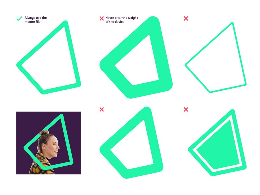
Never change the angle of the rocket.
Always use the original master artwork files. Never try to recreate the logo – it should not be altered in any way.
The Iress rocket is an important part of our brand identity. You can definitely have some creative fun with the rocket, but we also have some rules to make sure we are consistent in how we use the rocket as a creative device.
You can use the rocket in a variety of ways but never change the angle and always put the rounded edges on the outside and sharp edges on the inside. You can find more ways to use the rocket in the imagery section of this guide, too.
You can use the rocket as a strong symboliser of the Iress brand and as the main ‘character’ in a design application.
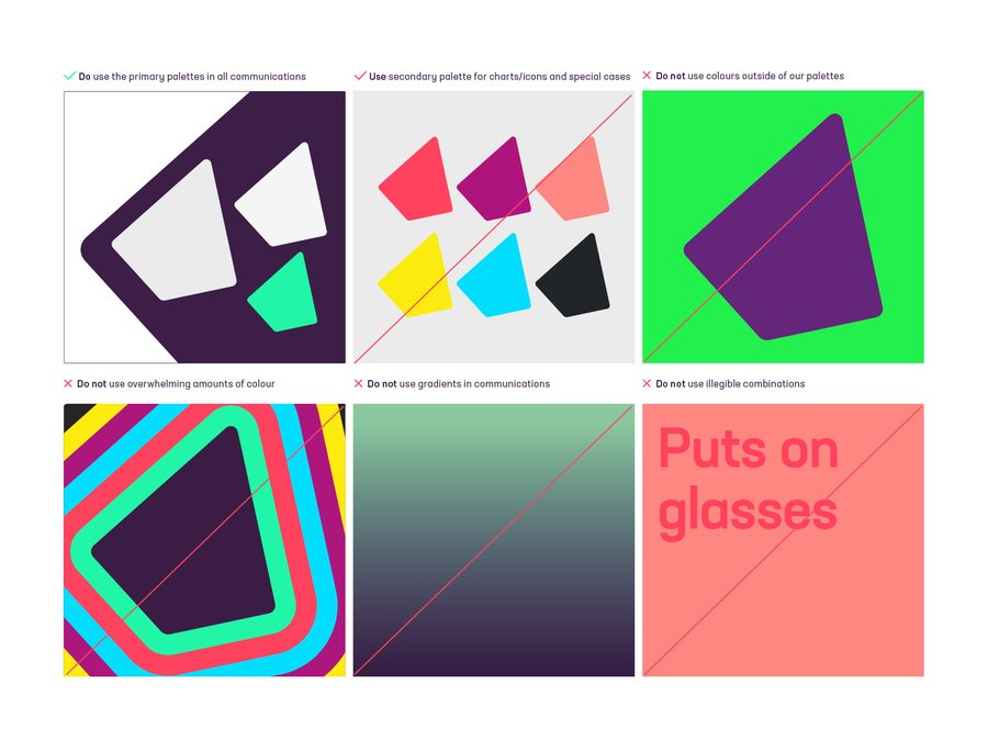
Our colour palette is an important part of our brand. Our primary palette is composed of a strong purple, vibrant green and supporting whites and greys.
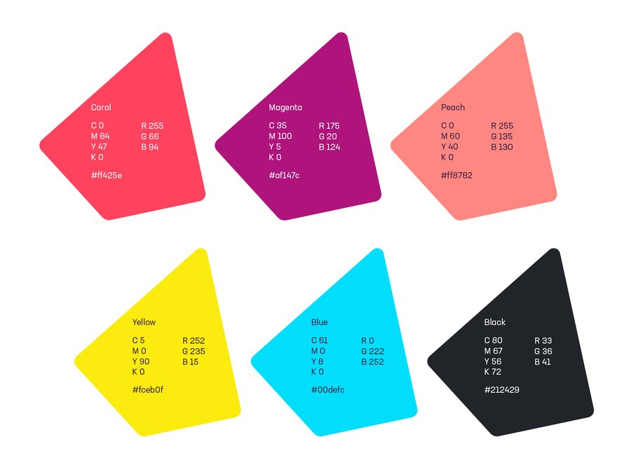
You can support the primary palette with a range of secondary colours. These are particularly useful in infographics and illustrations.
Colour.ase
Download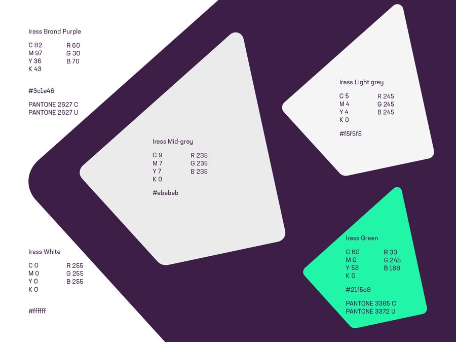
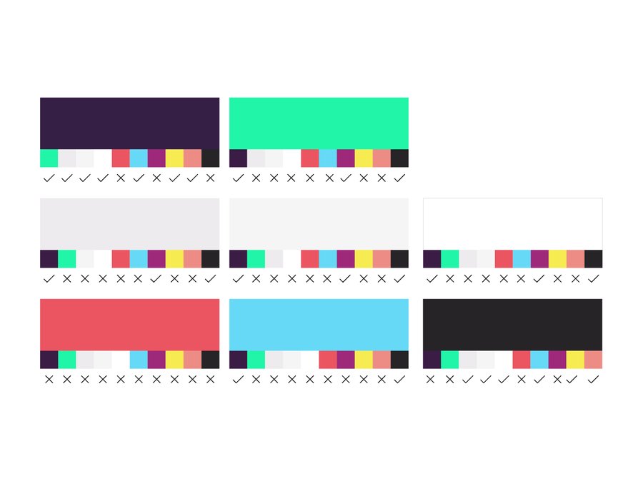
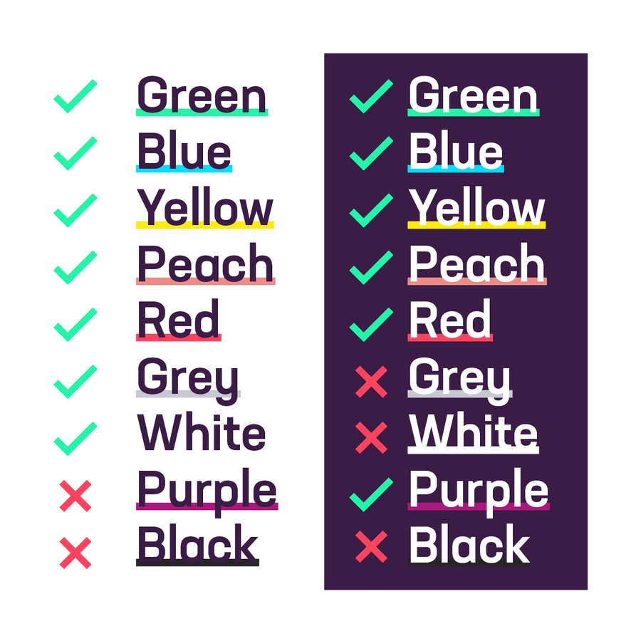
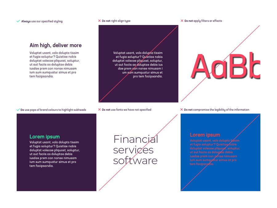
The Iress brand is for everyone so it’s important we think about legibility and readability as part of the design process. We have tested a number of different colour combinations to identify the strongest options for readability and accessibility. A cross indicates a fail in the ‘normal text’ field, although all passed the ‘Large text’ WCAG AA field readability. Avoid the non-compliant colours for critical text and graphics but keep the overall visual impact in mind.
You can test colours at webaim.org/resources/contrastchecker/
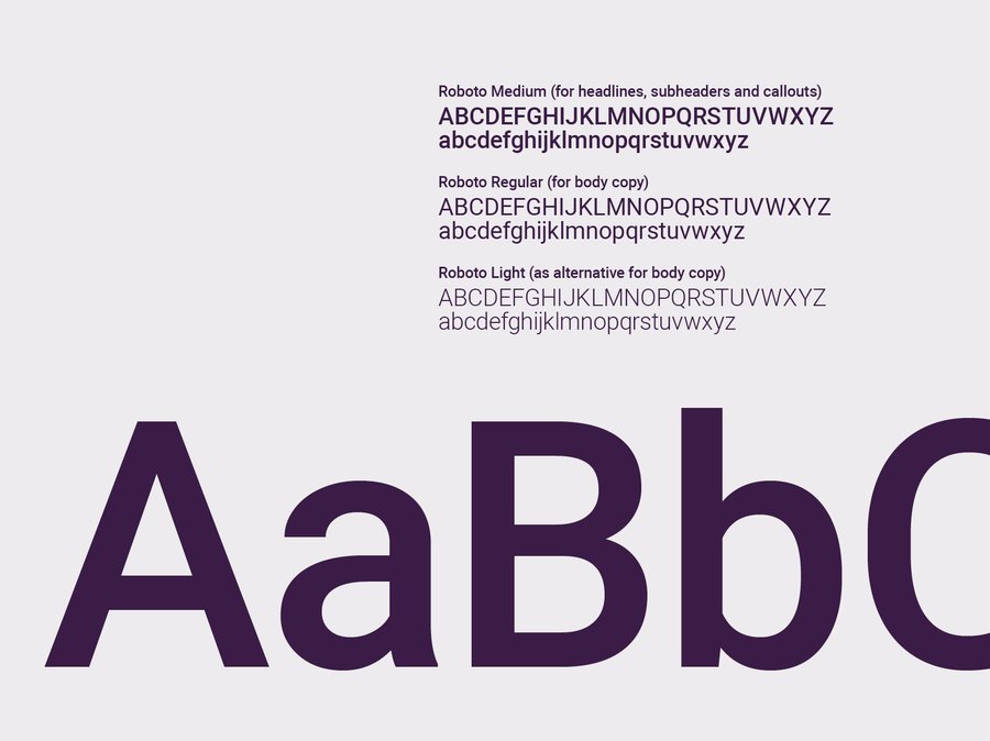
Our brand typeface is Neusa Next Std, a contemporary sans serif font. Its slightly condensed style gives it a distinct character while the generous x-height ensures excellent readability.
We use three weights: Medium, Regular and Light.
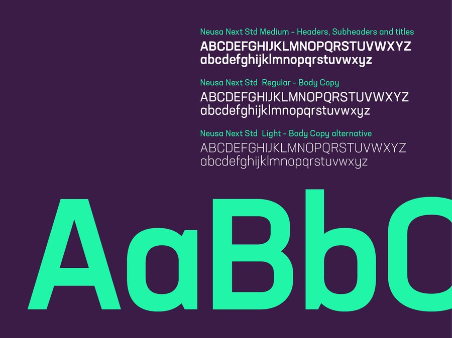
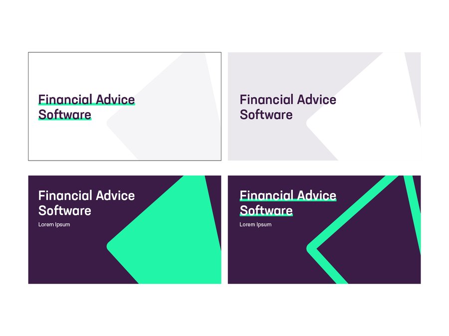
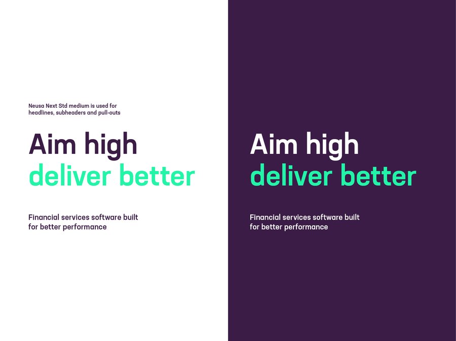
For pull-out quotes and subheadings we use Neusa Next Std medium. Combined with Neusa Next Std Light this gives us great flexibility and contrast to create impactful messaging. Our vibrant primary colours can be used to further enhance our typography by highlighting quotes, subheadings and statistics.
Headers, Pull-out quotes and subheadings
Weight: Medium
Tracking: Optical, -10%
Leading: 110%
Alignment: Left or centre
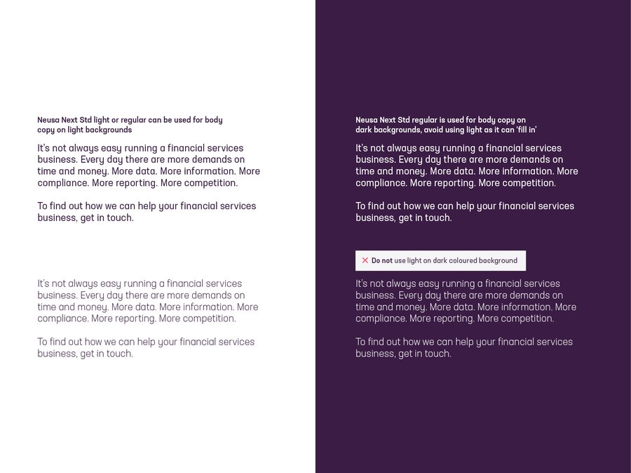
For body copy we use Neusa Next Std Regular. This is a workhorse weight that appears clearly on screen and in print at a range of sizes.
Body copy
Weight: Regular or Light
Tracking: Optical, 0
Leading: 120%
Alignment: Left
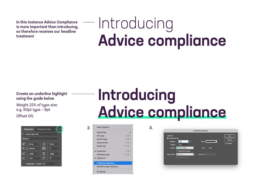
Headline styles should reflect the website, using Neusa Next Std in medium across headlines and subheaders/call outs etc. This is a great midpoint between the bold which can overshadow the fonts details and the regular that lacks headline style impact.
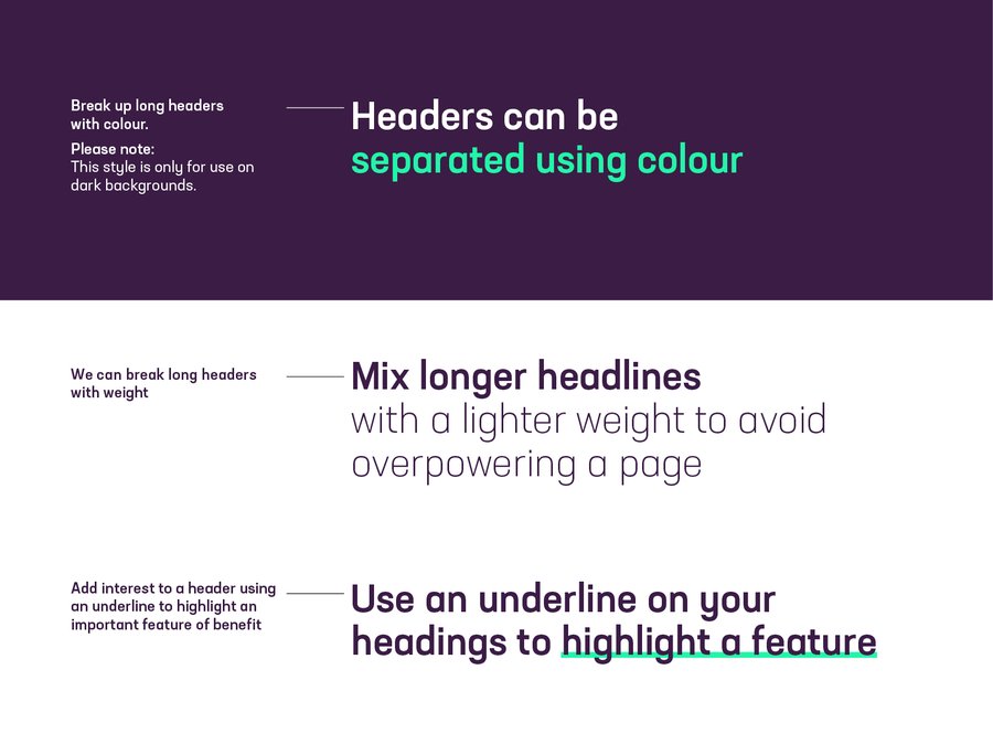
When using the mixed weights consider what you want to stand out. The same when using the colour highlight.
The underline can rarely be seen in our accessible secondary colours as well. These colour combos are shown in the Iconography section as well as documented below. Remember to use sparingly.
This is applied on underline and text colours styling
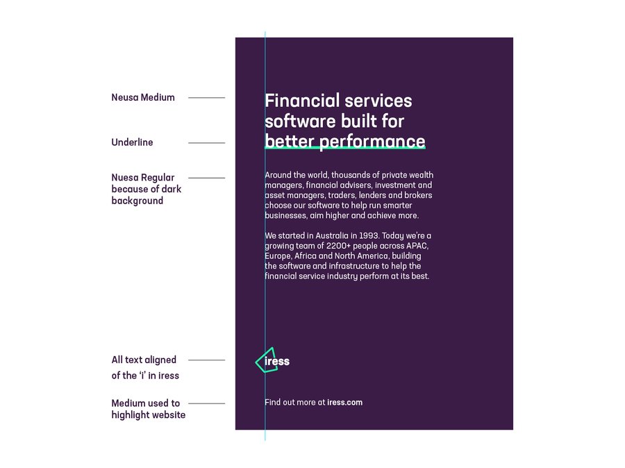
An example page using our typography styling The headline is set in Neusa Medium using the underline headline style. The body copy is set in regular weight as it’s against the purple background. The logo is positioned/aligned to the ‘iress’ in the logo
In instances where our brand typeface is unavailable we can use the Google typeface Roboto. This is regularly available in Google-based software.
To keep our typography consistent and our brand looking great, please stick to the simple rules on this page.
Writing for better performance
Finding the right words to persuade, convince and convert doesn’t always come easy. Trouble is, defaulting to robotic corporate-speak does.
Everyone is different and everyone writes in their own unique way. But if you write with our brand position in mind, write for people, be adventurous and follow a few little rules, you’ll help the Iress tone of voice come to life. It’s that simple.
Write for people
If you take one thing from this guide, remember this: we are people, our audience is too. Write with that in mind and you’ll find the words come naturally.
Be adventurous
Trial and test new ideas and new concepts without fear of failure. Keep learning, keep refining, be courageous.
Follow some rules
Not sure if it’s XPLAN or Xplan? IRESS or iress? We’ve created these guides to help everyone stick to the same style:
Iress Writing Style Guide
Iress A-Z Glossary
Product Writing Style Guide
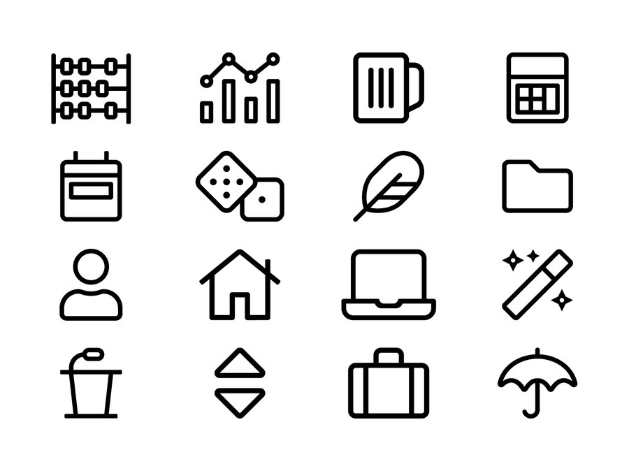
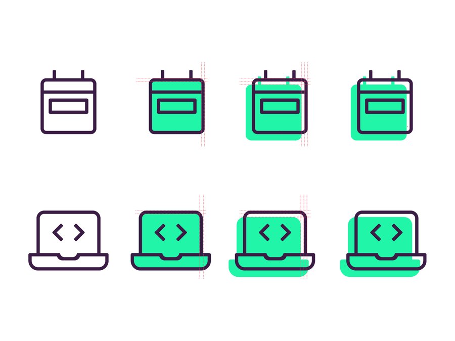
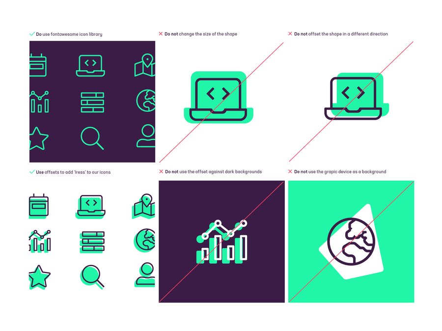
Our iconography is used throughout our brand. We use Fontawesome which has a light icon library that should offer a load of choices.
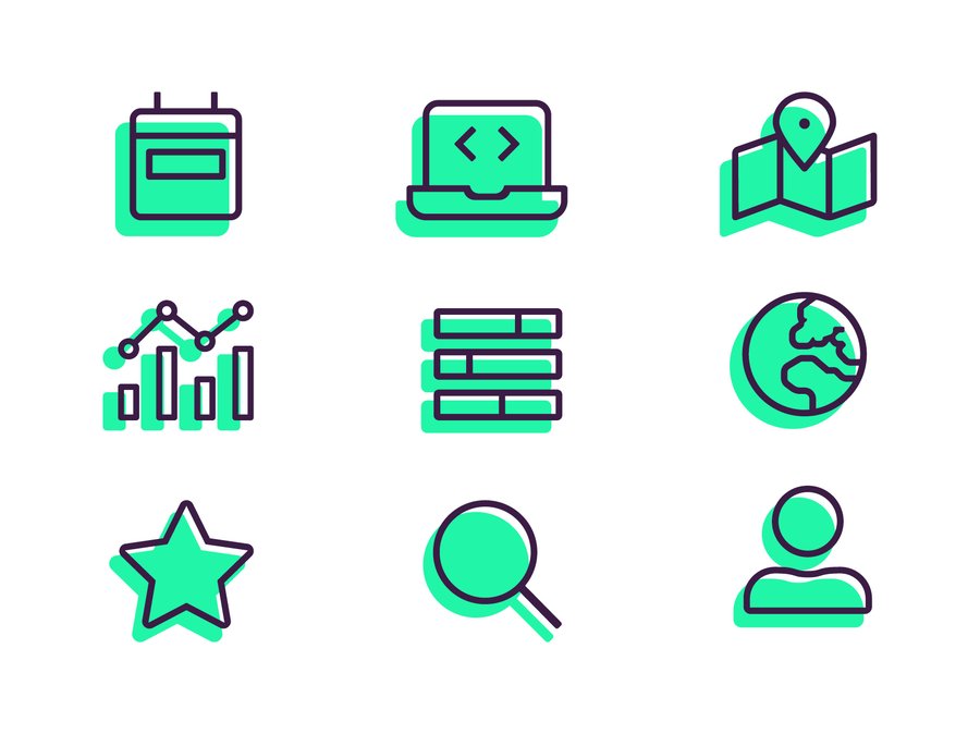
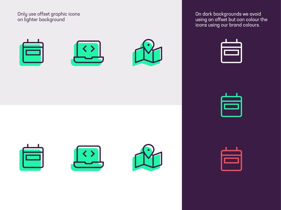
To customise our iconography and make them really feel like Iress, you can use an offset solid colour alongside the original icon.
We like to keep the solid to the bottom left of the icon and find this is a simple way to elevate the existing standard icon set.
Starting with a basic icon in light as well as the same icon in solid. Use the width of the stroke and duplicate the size to the left and
bottom. Move the solid shape down and back to align with the rule.
With the offset icon style we canuse some supporting colours to make things interesting. Please just take note of the colour combinations to avoid due to legibility.
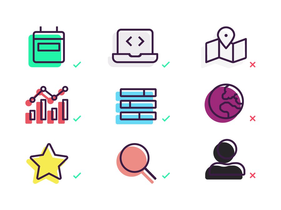
When considering using an icon, refer to this guide to whether you should use an offset or not.
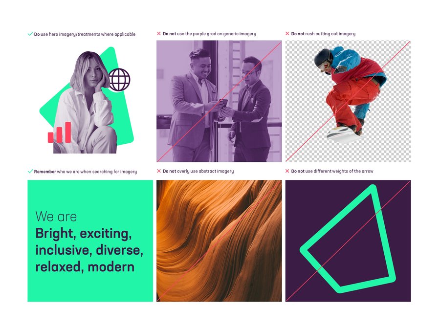
When thinking about or selecting imagery, we like to remind ourselves of what ‘we are’ as well as what ‘we are not’. This helps ground our thinking and allows us to make better choices.
We are
Bright, exciting, inclusive, diverse, relaxed, modern
We are not
Dull, depressing, exclusive, uptight, dinosaurs
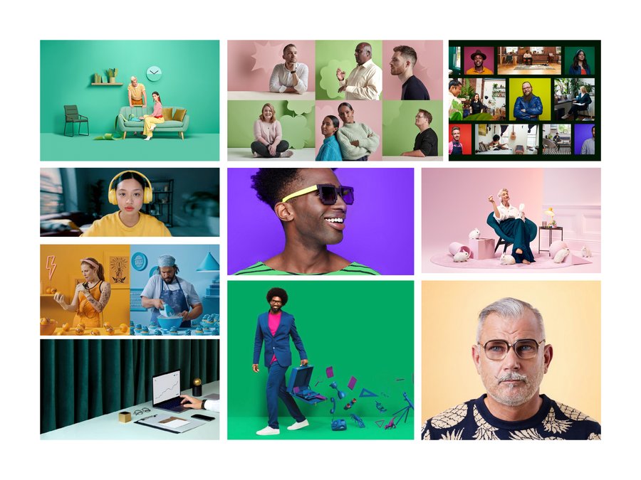
Photography and image selection is hard to get right. Above all, we want our brand imagery to show positivity and the feeling you get from doing something well. And we want to avoid predictable scenes, like men in business suits, coffee cups next to laptops, green plants for growth.
For more general imagery for features on blogs, in editorials or even used inside the graphic device we opt for bright/upbeat imagery. We can use posed, more focussed shots as well as the organic mid conversation shots. Variety is key here. If you begin to notice too much of one thing it’s time to use something else.
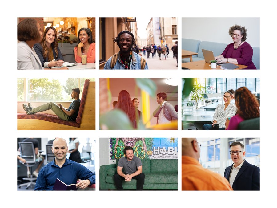
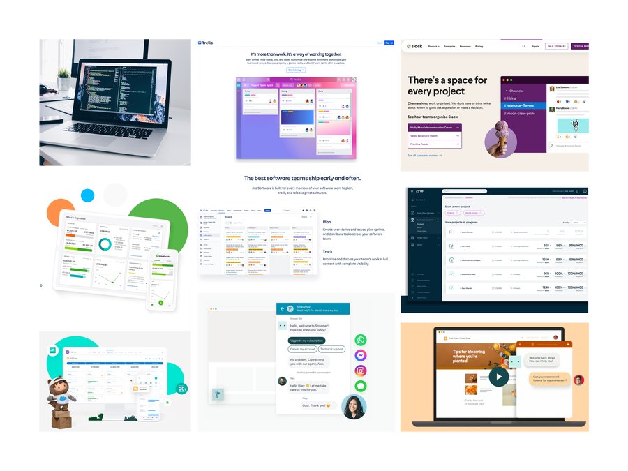
When showing devices on the website we should try to limit showing the actual devices whether that be with people using laptops and phone, or at desks on desktops. Flat software graphics could replace insitu shots as well as give an indication of the Iress software.
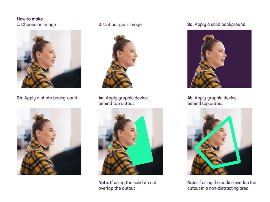
Our hero imagery leads the way. Each one should be composed of a combination of cutout treated image, rocket device, iconography in light/solid or offset. Follow the six steps for the best way to create a hero image.
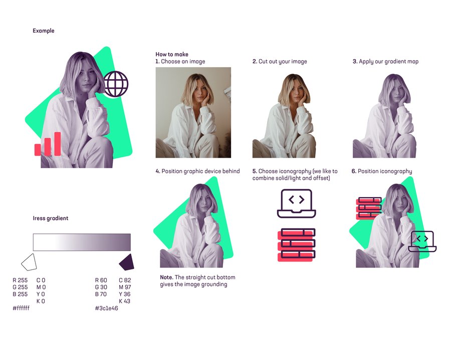
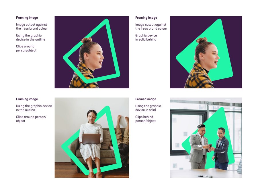
You can also frame an image using the rocket device:
If you are using the arrow in the image treatments, always use the master outline file and don’t change the angle of the rocket.
Framing image
You can also frame the image using the rocket. Always use the master outline file and don’t change the angle of the rocket.
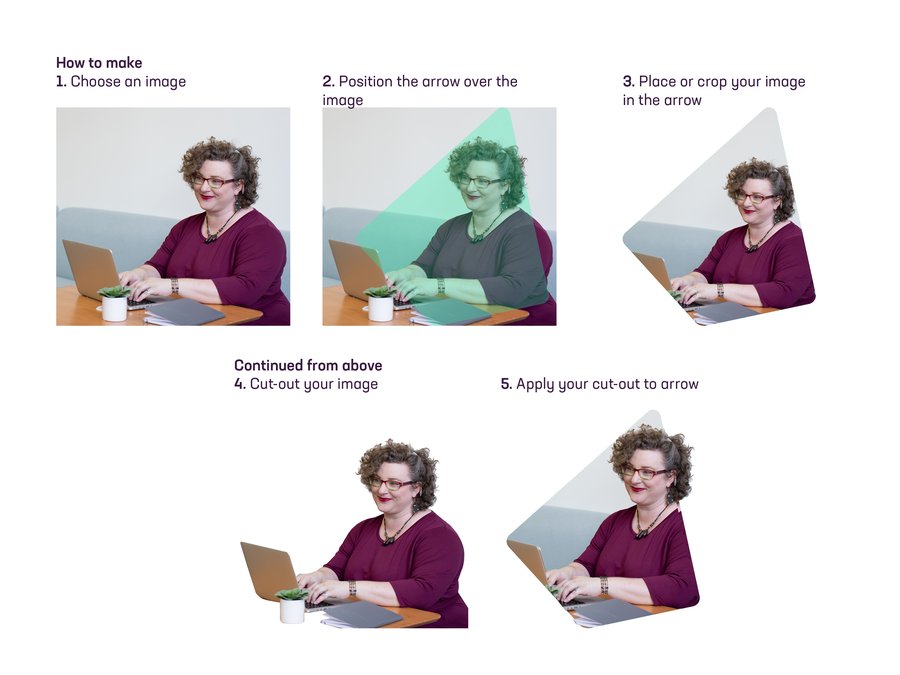
Device as window
You can also use the rocket as a window. Your image can sit neatly inside the window, or you can have an area ‘break-out’ of the shape to develop interest. Always use the master file and please don’t change the angle of the rocket.
If you have any specific questions or needs please do not hesitate to contact
Chris May | Chris.May@iress.com
